
Fukinsei (不均斉) is the Zen aesthetic principle of deliberate asymmetry — the practice of avoiding the dead centre so that a composition reads as alive rather than resolved. In Zen thinking, symmetry implies completion, and completion implies an ending: something perfectly balanced has nowhere left to go. It is the first of seven characteristics of Zen art set out by the philosopher Hisamatsu Shin’ichi in ‘Zen and the Fine Arts’ (1958), though the sensibility itself took shape in Japan from the twelfth century, as Zen reshaped painting, calligraphy, garden-making and above all the tea ceremony.
Fukinsei is not randomness but considered imbalance, and it rests on a rule that is rarely stated: one element must hold steady for another to be uneven. This article sets out where that steady element sits in a kitchen, a living room and a bedroom, and why asymmetry attempted without one reads as a mistake rather than a decision.

Symmetry Implies an Ending
What is perfectly ordered is, in a sense, static — close to death. What is deliberately uneven remains alive. There is a phrase for this quality: mikan no bi (未完の美), the beauty of the incomplete.
The instinct runs well beyond architecture. In sumi-e ink painting a single off-centre branch says more than a full, balanced canvas. Tea bowls are prized precisely because no two are alike. In a chashitsu, the tea room, duplication is consciously avoided: if there are fresh flowers, a painting of flowers is not permitted; if the kettle is round, the water vessel must be angular. A vase set in the tokonoma alcove is never centred, because centring would divide the space into two dead halves.
None of this is disorder. Fukinsei is balance achieved through difference — considered imbalance, not randomness. That distinction is the whole of it, and it is where most attempts come apart.
Seven Characteristics of Zen art
It matters that fukinsei arrives with a family rather than alone. Hisamatsu’s seven characteristics of Zen art are fukinsei (不均斉), asymmetry; kanso (簡素), simplicity; kokō (枯高), austere loftiness; shizen (自然), naturalness; yūgen (幽玄), subtle profundity; datsuzoku (脱俗), freedom from convention; and seijaku (静寂), tranquillity.
Two of those are terms that have shaped how we work for years — shizen, which governs how materials age, and yūgen, which sits at the centre of the studio’s thinking. Fukinsei is not a newly fashionable idea imported to stand beside them. It is their sibling, from the same list, describing the same underlying position from a different angle.
It also sits inside wabi-sabi rather than beside it. Where wabi-sabi finds beauty in what age and use have done to a thing — a subject we took up in In Praise of the Imperfect — fukinsei governs a decision made much earlier, at the drawing stage, before anything has had a chance to weather. One is about accepting what time delivers. The other is about what you choose to place off-centre on a Tuesday afternoon.
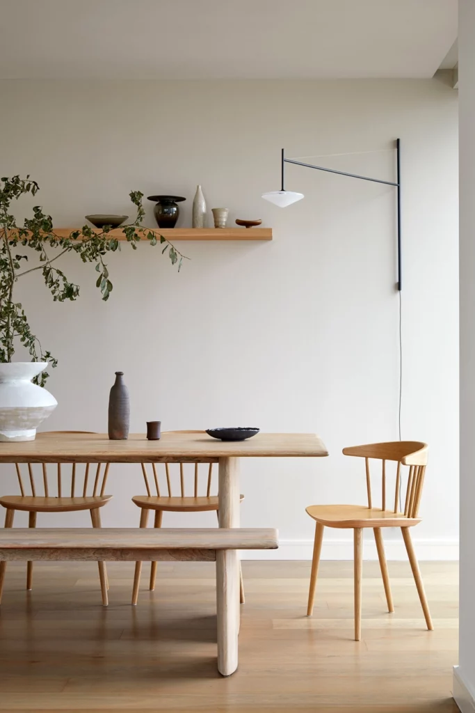
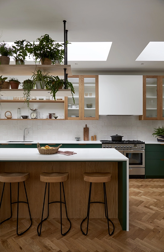
Asymmetry Needs an Anchor
Here is the rule that neither the tea room nor the usual styling advice makes explicit: fukinsei requires something steady to be uneven against. Strip all the symmetry out of a room and you do not get liveliness, you get noise. The tension has to have two sides.
Kitchens are where Yoko Kloeden Design uses this most often. At Botanic House and Verdant Oasis, the run of wall units and shelving is deliberately asymmetrical while the island stays calm and symmetrical. The island anchors the room; the uneven wall composition keeps it alive. Reverse the two and the room simply looks unresolved, because the eye has nothing against which to measure the irregularity.
Two living rooms show the same rule solving opposite problems. At Barks & Bliss in Surrey, the reception room had no chimney breast at all. We introduced one — and because nothing obliged it to sit in the middle, we placed it deliberately off-centre, with a wall-to-wall media unit running beneath. Freed from centring, the whole wall reads as considered rather than automatic.
At Architecturally Revived Haven in Richmond, the opposite: a chimney breast already sat squarely in the centre and was never going to move. So the asymmetry had to come from what surrounded it — two open shelves on one side, a single shelf beneath the window on the other. That quiet imbalance offsets the symmetry of the chimney, so the wall never reads as rigidly mirrored. The anchor was given; only the counterweight had to be designed.
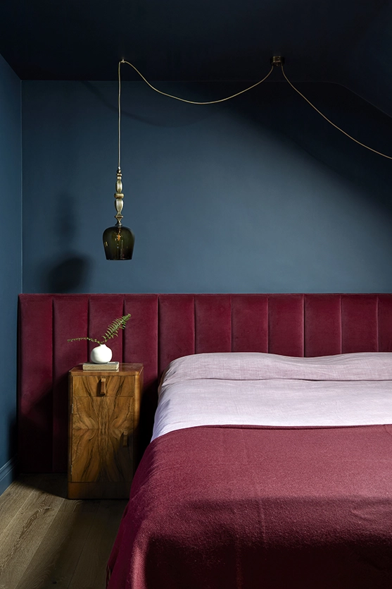
Bedrooms are the simplest case of all. In the Jewel Box Suite, a pair of hand-blown glass pendants hangs asymmetrically either side of the bed, on cord stays that follow a sloping eaves ceiling. At the Culinary Inspired Home, a pendant on one side is answered by a table lamp on the other. In both, the bed itself is the anchor — centred, symmetrical, unarguable — which is precisely what allows the lighting either side of it to differ. It is one of the easiest moves available, and it stops a bedroom feeling like a showroom.
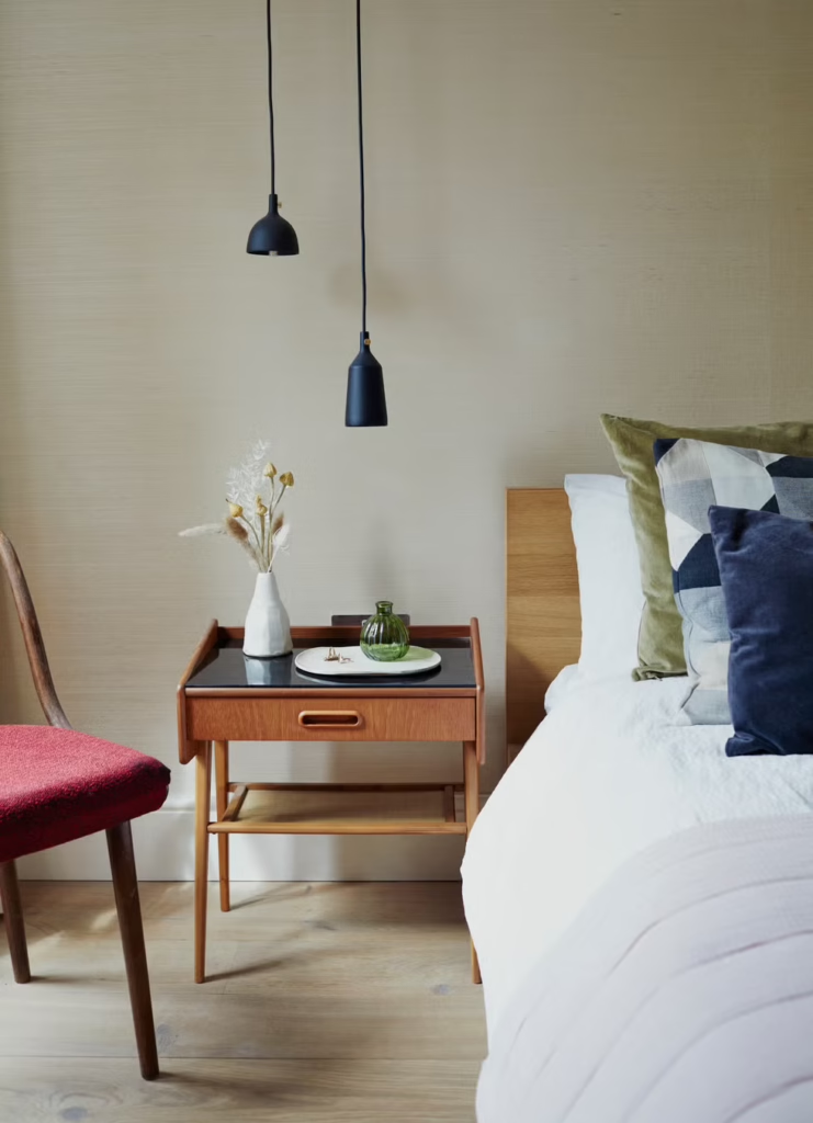
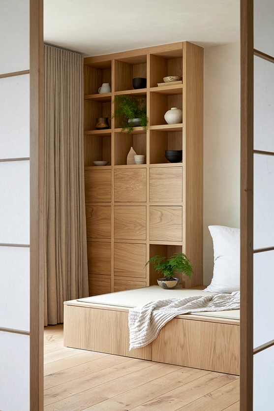
When It Reads as a Mistake
Asymmetry fails in a predictable way, and the failure is almost always a question of degree. Off by a little looks like an error. Off by enough looks like a decision. A picture hung fifty millimetres from the centre of a wall does not read as fukinsei; it reads as carelessness, and the eye keeps returning to it wanting to correct it. Move it far enough that no one could mistake it for an attempt at centring, give it something on the opposite side to hold the wall down, and the same picture becomes a composition.
The second failure is subtraction without replacement. Breaking up a matching pair of bedside lamps and leaving the second position empty gives you a gap, not a tension. Fukinsei works by difference, which requires two unlike things — not one thing and an absence. This is where it parts company with the discipline of cutting away, which is about removing what competes. Here you are not removing. You are unbalancing.
The working test is simple. If you can fold something down the middle and the two halves match, introduce one considered difference. One. Not chaos, and not a room in which nothing agrees with anything.
In the Plan, Not Just on the Wall
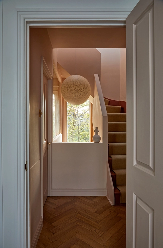
At architectural scale fukinsei stops being a matter of styling and begins to govern how volumes and circulation are arranged. Rather than a layout organised around a central axis, rooms can be staggered and openings set off-centre, so that a house is moved through indirectly rather than taken in at once — much as a temple complex staggers its buildings instead of lining them up. A double-height space pushed to one side, a window positioned to frame a particular view, a stair that turns rather than rising formally: these shape how light enters and how the body moves.
The most complete example is Katsura Imperial Villa, where the principal buildings sit in a staggered, stepped arrangement and the garden is composed so that it can never be seen whole. We wrote about it in The Villa That Faces the Moon. A symmetrical Georgian or Victorian façade obliges you to nothing behind it. The front elevation can stay exactly as it was built while the layout it conceals is composed on entirely different terms.
Composed Yet Unfinished
What fukinsei offers a home is not irregularity for its own sake but a quality of openness — rooms that feel composed yet unfinished, settled yet still becoming. That is a difficult thing to photograph and an easy thing to live in, which is roughly the right way round.
It is also why the principle never dates. It is not a look that arrived and will leave. It describes what the trained Japanese eye already finds beautiful: the arrangement that has not closed itself off, and so still has somewhere to go.