In Japanese ink painting, the master’s hand is recognised not by what is included but by what has been cut away. A branch removed from the composition. A corner of the landscape left unpainted. An entire figure suggested by three brushstrokes rather than rendered in full. The Japanese call this Kirisute no Bigaku (切り捨ての美学) — the aesthetics of cutting away — and it runs through every discipline of Japanese visual culture, from screen painting to ikebana to garden design.
The principle is not complicated: when every element demands attention, none receives it. Applied to residential design, this is one of the most common mistakes we encounter — and one of the most transformative to correct.
The Room Where Eyes Cannot Rest
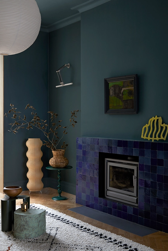
A homeowner loves deep forest green. Deeply, sincerely. So the fire surround is green. The sofa is green. The side table is green. The cushions pick up the same shade. Where do the eyes rest? Nowhere. The room has no hierarchy, no focal point, no moment of quiet against which the green can breathe. What was intended as a considered choice has become a wash — the colour is everywhere, so it is effectively nowhere.
The same happens with metals. Brass is a beautiful material — warm, living, capable of catching light in a way that lifts an entire room. But brass light fittings, brass switches, brass taps, brass stool legs, brass skirting boards? It stops being beautiful. It becomes excessive — or worse, it reads as poor taste, which is the very last thing the homeowner intended.
The issue is not that these clients have bad instincts. Their instincts are often excellent — they are drawn to a material or colour that genuinely moves them. The problem is applying that love without hierarchy. When every surface within a single room carries the same accent, the accent disappears. It becomes background noise. The room, despite being filled with things the owner adores, feels unsettled rather than composed.
To be clear: repeating a loved element across different rooms is not the problem. Green in the living room fire surround and green in the bathroom tile can create a beautiful thread through the home, provided it appears intentionally in each space as the feature. The difficulty arises when every element in a single room demands attention, leaving no contrast, no quiet, no rest. But before we can even begin to establish hierarchy, the home often needs a more fundamental reckoning — the practice of Danshari — letting go before you design — which clears the ground for considered choices to land.
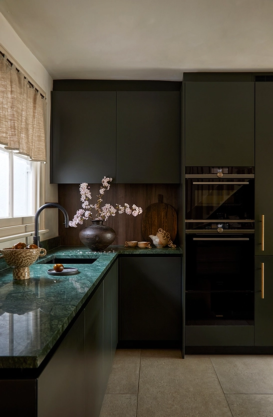
One Feature, Two at Most
In our practice, we work with a simple principle. A room can hold one feature comfortably — a material, a colour, a piece of furniture, an architectural detail that draws the eye and gives the space its identity. It can accommodate a second feature if the two are in genuine dialogue: a bold fire surround and a considered chandelier, for instance, each occupying a different plane of attention. Three competing features overwhelms the composition. The eye has nowhere to land, and the room feels busy regardless of how beautiful each individual element may be.
The rest — and this is the discipline — must play a supporting role. Quieter materials, receding tones, understated hardware. Not lesser quality, not an afterthought, but a deliberate decision to let something step back so that something else can step forward. A statement brass lighting above a kitchen island becomes a show stopper precisely because the cabinetry behind it is quiet, the handles are understated, the splashback does not compete. That same brass, repeated on every surface in the room, loses its ability to move anyone.
This is what Kirisute no Bigaku means in practice: the willingness to cut away, even from things you love, in service of the whole. It shares a kinship with the principle of Taru o Shiru — less is more, though where Taru o Shiru asks us to recognise when we have enough, Kirisute no Bigaku asks us to actively remove what disrupts the composition.
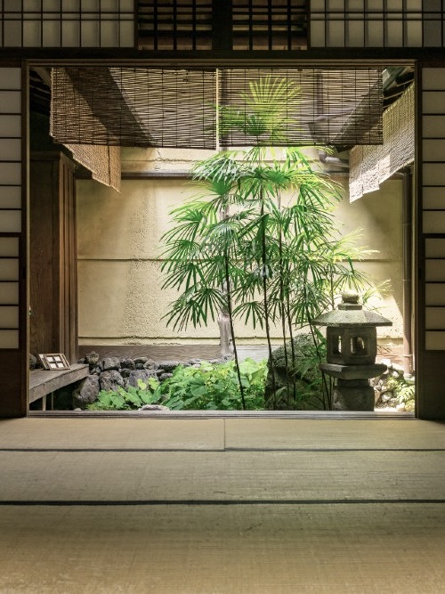
Restraint as a Material Language
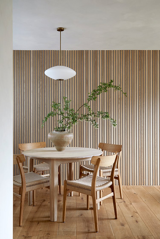
Our Essence of Japan project demonstrates what becomes possible when this discipline is applied from the outset. The entire material palette is built from two primary materials: oak and limewash paint. That is not a limitation. It is a decision — and it is the reason the home has been described in the press as a ‘pocket of peace.’
Within that restrained palette, each room has a single, clearly defined feature. In the guest cloakroom, INAX porcelain tiles in a split bamboo form — sourced from Japan, their gentle curves catching light differently as the day moves — are the one material moment. The room exists as a quiet envelope for that intervention alone. In the living area, bespoke wooden slatted acoustic panels give the space its character. In the master bedroom, a wall-to-wall oak headboard inspired by a boutique hotel in Nara is the sole dramatic gesture, with tatami and simple furnishings playing their supporting roles without competition. You can see the project from here.

Five press features and one design award — in Elle Decoration, Enki, Livingetc, Grand Designs, YUZU Magazine, and Dezeen Awards 2024 — have described this project consistently. Not as minimal. Not as sparse. As calm.
The Enki feature, titled ‘Space and Pause,’ captured something essential about the home: that its serenity comes not from absence but from clarity of intention. That calm is the direct result of hierarchy — every room knows what its feature is, and everything else has been edited to serve it. We explore this philosophy of material warmth within restraint further in our article Where Minimalism Meets Warmth, and the same sensibility appears in the Japanese art of restraint in everyday objects.
Editing as a Creative Act
Part of the architect’s role, as we understand it, is curatorial. We help clients understand that editing their choices is not a compromise — it is the creative act itself. Choosing what to leave out requires more confidence than choosing what to include. It asks the homeowner to trust that one beautifully chosen element, given room to breathe, will bring more pleasure than five competing for attention.
This is where the parallel to Japanese art becomes most vivid. The ink painter who uses three brushstrokes instead of thirty is not being economical. The garden designer who places one stone and then stops is not being lazy. They are practising Kirisute no Bigaku — the understanding that what is removed from the composition is as important as what remains. In residential design, the same principle holds. A home with fewer materials, used with greater intention, will always feel more resolved than one where every surface introduces something new.
We have written about the relationship between subtlety and depth in our article The Quiet Beauty of Yūgen, and about the quiet strength of interiors that do not shout in In Praise of the Subtle. Kirisute no Bigaku is the discipline that makes both possible.

The Calm That Comes from Hierarchy
A home where every room has a clear hierarchy — where materials know their role, where the eye is guided rather than scattered — is a home that produces calm. Not because it is empty, not because it denies personality or colour or warmth, but because every element has been chosen with the discipline of knowing what to leave out.
That discipline begins with a single question, asked honestly in every room: what is the one thing here that deserves to be seen? Answer that, and the rest follows.