
Hikari (光) is the Japanese design principle of light — though in Japanese aesthetics light is inseparable from shadow, and the principle is as much about where darkness is allowed to sit as about how much daylight a room takes in.
Jun’ichirō Tanizaki made the case for this in his 1933 essay ‘In Praise of Shadows’ (陰翳礼讃), arguing that the beauty of a Japanese room lies not in its objects but in the gradations of shadow between them — and that a room lit evenly throughout loses that depth entirely.
This article puts hikari to work in three rooms where darkness does the heavy lifting: a bedroom where dark walls stop four o’clock light bouncing and hold sleep, a hallway that reconciles one half of a couple’s navy with the other’s orange, and a guest loo. It also sets out the ten-minute rule for deciding where dark colour belongs — and where it does not, which is kitchens, home offices and anywhere children study.
In London the question turns out to be more urgent than it ever was in Kyoto. A north-facing Victorian room gives you so little daylight that what you decide to do with the dark becomes the whole decision.
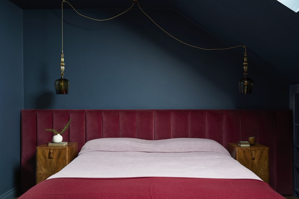
1. Bedroom
The early morning light streaming through a tiny gap in the curtains at 4 a.m. used to be a disturbance until I discovered the transformative effect of a dark bedroom. Instead of bouncing around the room, the light remains as a subtle stream, making a significant difference in sleep quality. Several of our clients have embraced this advice, and our ‘Jewel Box Suite’ project is an elegant example of the concept in action.
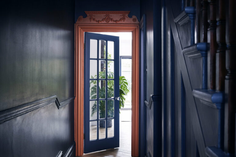
2. Entrance Hallway
I often jest with our clients that they can use dark colors in any area of their home where they spend no more than 10 minutes at a time. Transition spaces like entrance hallways are perfect for making a dramatic impact and welcoming guests. In our ‘Elegant Family Abode’ project, we combined Mrs. Client’s favorite colour, navy blue, with Mr. Client’s favorite, orange, to create a striking hallway.

3. Guest Loo
The guest loo is typically the smallest room in any home, and people are more open to embracing bold designs in this space. It provides the perfect opportunity to incorporate darkness, as guests typically spend minimal time there. It is a chance to showcase sophisticated aesthetics, as demonstrated in our ‘Past Meets Present’ project, where a dramatic wallpaper choice added depth and intrigue.
In contrast to these spaces, I would not recommend using dark colors in rooms where productivity is crucial, such as the kitchen, home office, or children’s study areas.
If you are interested in learning more about Japanese design philosophy, or are considering the ways in which your home can be adapted to create a better sense of calm and balance – this guide is for you.
Discover how Hikari connects to our wider design philosophy in The Quiet Beauty of Yūgen.
Both informative and evocative, this guide has been a labour of love and we look forward to hearing your thoughts on it.
You can sign up to this free and exclusive guide by clicking this link.
If you are interested in having inspirational content delivered straight to your inbox, you can also sign up to our monthly newsletter below.
Further reading:
Hikari (光) Is the Japanese Concept of ‘Living With Light’ — Yoko’s column for Livingetc, July 2026